Friday, June 15, 2012

final lab


Reference Map


Thematic Map

Los Angeles County is located in Southern California.  This is one of the most populated counties in the United States.  Traffic congestions are very common when traveling in any of the major highways within Los Angeles County.  My reference map gives an overview on where the county is located geographically.  In addition the reference map provides an overview on how massive the Station Fires spread within the Los Angeles National Forest in 2009.  Since Los Angeles County lies within an area where the prevailing winds come from the west it influence the spread of the fires towards the mountain's slopes which are covered with dry brush that fueled the Station Fires of 2009. 
In my thematic map, I displayed the most populated places (cities) within Los Angeles County.  From the thematic map, only a few of the populated areas are in close proximity within the Station Fires that occurred in August/September 2009.  In addition, I also added the major highways in Los Angeles County.  The Station Fires occurred in foothills in the northern edge of the Los Angeles metro area.  One key aspect that is mentioned is the terrain; therefore, I added a Digital Elevation Model or DEM to show the spread of the Station Fires in 2009.  As Captain Mark Savage, spokesman for the Los Angeles County Fire Department: “In this rugged, steep terrain, with this brush as thick as it is, we are having difficulties establishing containment lines where we can make a stand” (Zavis, 2009).  The terrain in where the fire originated from made it an obstacle to reach; therefore, terrain of the area must be taken into consideration. 
            According to the New York Times, “Los Angeles Fire Was Arson, Officials Say,” the fire dubbed Station Fires has burned for a week in the Los Angeles National Forest “the fire had consumed nearly 150,000 acres – an area more than two-fifths the size of the city of Los Angeles – and had become the largest in the county’s history” (O’Conner, 2009).   In addition, the fire was fueled by dry brushes, warm temperatures, and steep slopes.  The terrain of the Los Angeles Forest created barriers that slowed down firefighter’s response time.  Besides the fuel and terrain, the Station Fires spread rather rapidly without the Santa Ana Winds, which usually spread the Southern California’s wildfires.  The Station Fires burned down 60 homes and more than 250 square miles.  As the days progress, the mountainous area provided the fuel for the fire to continue burning.  Towards the lowlands of the northern edge of Los Angeles there are many dry brushes and slopes to aid the fires fuel mechanism.  Therefore, in thematic map the Station Fires spread progressively more towards north of the original fire.
            Although thousands of residents were evacuated, the winds were light, which prevented the Station Fires to reach nearby communities.  In the thematic map, the lowlands residence in the northern edge of Los Angeles  homes were saved.  One reason, “More than 2,500 firefighters were on the line.  More than 20 helicopters and air tankers were preparing to dump water and retardant over the flames” (www.cbsnews.com).  Also Southern California is equipped with major highways that allowed firefighters to mobilize quicker to respond to the fires.  And winds were not a major factor like previous wildfires being spread by the infamous Santa Ana Winds. 
            In a special summary of the Station Fires in Los Angeles County, the National Oceanic and Atmospheric Administration website states “Nearly 40 miles (64 km) of the Angeles Crest Highway was closed indefinitely due to fire damage, with repair estimates of $12million USD, according to the California Department of Transportation” (December 2009).  The Station Fires did leave its marked in California's fire history as well as leaving homeowners homeless.  Besides damaging highways and burning homes, “the fire, which has sent plumes of thick smoke spiraling as much as 20,000 feet into the air, [was] creating its own wind patterns, making it unpredictable” (www.cnn.com).  Although residences in the populated places did not loose their homes they were affected by the unhealthy air cause by the Station Fires and had to plan different routes if one other highways were close off.


Reference Sheet


“5 Trapped As Calif. Wildfire Swells.”  2 Sep 2009.  http://www.cbsnews.com

“Angry fire’ roars across 100,000 California acres.”  31 Aug 2009.  http://acticles.cnn.com/2009-08-31/us/california.wildfires.com


O’Conner, Anahad.  “Los Angeles Fire Was Arson, Officials Say.”  New York Times.  4 Sep 2009.

Zavis, A., Mozingo J., and J. Garrison. “Station fire claims 18 homes and two firefighters.”  Los Angeles Times.  31 Aug 2009.


Tuesday, May 29, 2012

US Census 2000


     According to US Census Bureau, the map provides spatial information about Asian population distribution in continental United States.  The darker purple area shows were the majority of the Asian population are concentrated.  In the States of California and New York has the majority of the Asian Population, specifically the the cities of San Francisco, New York City, and Los Angeles County.  While in the Great Plains and along the Rookie Mountains there are hardly any Asian population.  From what I can observed most of the Asian population are concentrated along major cities of continental United States.


     In the southeastern portion of the United States is where the Black population are located.  The southern states where most of the plantations were located and where Black population are concentrated.  The States of Mississippi, Louisiana, Alabama, Georgia, South Carolina, and North Carolina are the predominant states which have large Black population.  One particular region of interest is the southern portion of the Mississippi River, where there is heavy congestion of Black population.  The Great Plains, New England, and Rookie Mountains have hardly any concentration of Black population.


     The southwest portion of the United States is concentrated with an other race.  Since the concentration is in the southwest, along the US-Mexico border, I'm assuming the other race is Latino.  Also, southern Florida also stands out with other race, but not in the same magnitude as the southwest portion of the United States.  Most notably from the map is the southern portion Central Valley, a predominant agricultural region of California.  This particular region has heavy concentration of other race compare to the rest of the southwest.  Since most of the field workers are of Latino background and also to the areas history of hiring guest worker from Mexico (Bracero Program) I'm assuming Latino is the other race.


    Overall the census map series provides geospatial information of where certain ethnicities live within the continental United States.  One population that I was surprised with was the Black population concentration in the south; I assumed that Midwest would have bigger population than the south due Industrial Revolution migration.   Besides the census map series, GIS has become more easier and fun.  This new perspective has to do with my growing knowledge of GIS usage.  Besides having more knowledge on GIS usage, it allows me to better provide spatial information to any map user.  Now creating maps can be made from my perpective to spread better geospatial information to map viewers.


Monday, May 21, 2012

Sierra Nevada DEM


     The area of interest is the southern portion of the Sierra Nevada, between the southern portion of San Joaquin Valley and Owen's Valley.  The Sierra Nevada is a distinguishable feature that is unique to the California's landscape. This area is perfect to show the usage and applications of DEMs in ArcGIS.   From the 3D model perspective the area looks very hard to maneuver by vehicle; therefore, DEM and ArcGIS allows the observer to scope the area using this tool.  In addition, other assets (Slope Model, Aspect Model, Shaded Relief Model) of the tool allows ArcGIS users to get overall picture of the terrain. 

Geographic Coordinate System:
  • Spatial Reference:  GCS North American 1983
  • Angular Unit:  degree 0.017453292519943295
Extent:
  • Top:       39.8291666661
  • Left:      -105.78888889
  • Right:    -104.969444445
  • Bottom:  39.3838888883


Tuesday, May 15, 2012

Map Projections

     Map projections are significant because each area is unique to its projection. Since the earth is almost an oval shape, the map user relies on the mathematical projections to represent the world into a map. However, with map projections some areas are subject to distortions.  Depending what the map user wants, the area can be conformal, equidistant, or equal area. The reason for so many map projections it gives the map user choices on whether they want to focus on for specific maps. With so many map projections the user can tailored their map to thier needs and wants.
     The potential of map projections it gives an idea of different areas projection. Some areas may get distorted severely, while other locations it remains the same. Depending on what the map user wants to display, each projections can be tailored to specific locations. For example, Mercator and Eckert1 both are conformal maps and they make Antartica look abnormally larger than what it is normally. While in Sinusoidal and Bonne, these maps can good area overview of the planet earth in general. Now in Azimuthal Equidistant and Equidistant Conic makes the equator of the earth appear wider and the continents appear smaller.
     Some of the perils, are the distance being projected. In the first map, after measuring distance between Kabul and Washington DC using Geodestic, Loxodrome, and Great Elliptic, each had different distance numbers. For example, in the Geodestic segment it read 6,934.478105 miles while in Loxodrome it read 8,112.06673 miles. In addition, with Loxodrome the length kept changing while Geodestic and Great Elliptic the length remained the same. Depending on what the map user is using, distance can be off depending on what the map user uses.
      Although different map projections gives a map user the choice on what to use, it can create different distortion or different widths. No map projections are perfect, thats why there are different map projections to choose from. The map user must know that with different styles of map projections comes with different outlooks. When it comes to map projections, it really falls on what the user wants.

Monday, May 7, 2012

GIS Potentials and Pitfalls


     This is the the second time I have taken an introduction to Geographic Information Systems (GIS) course, and I preferred the Geog 7 tutorial from my previous class experience at community college.  For one, I was able to work in my own pace and not worry about keeping up with the rest of the class.  I will admit, I'm a little bit slow when it comes to using the ArcGIS software and the Geog 7 ArcMap Tutorial was perfect for me.  Although, I enjoyed my experience with Geog 7 ArcMap Tutorial, the excersise had some potential and pitfalls.
     One of the things that I enjoyed the most, I mentioned this before, is the ability work in my own pace.  The tutorial's walk through steps were very clear.  I enjoyed having the tutorial having the pictures on how the product was supposed to look like in each slide.  Besides having the pictures, towards the end of the excersise, it did tested us on what we learned from previous slides.  I did had to look at previous pages in order to remember how to complete some of the steps, but for the most part I remember.  New users of ArcGIS would find this excersise pretty straightforward. 
     Now some of the pitfalls, was when I had to work from the remote access in my pc.  When I did worked on it from my home's pc, the software was extremely slow.  Even though I saved my work from the remote access in my flashdrive none of  the work appeared during normal lab hours while on campus.  The result of this, I had to restart from the beginning; however, having to restart from the beginning made me more proficient in ArcGIS.  In addition, some of the steps were kind of vague, but for the most part I was able to figure it out for the most part.  For example, in excersise one, I had to manually expand the data sheet in ordet to look like the tutorial (using the blue arrows), it took me a while to figure where were the blue arrows.  For the most part, the ArcMap Tutorial was pretty straight forward.
     Overall, the excersise was pretty straight forward and user friendly for the most part.  The excersise allows the user to work in his or her own pace. Instructions are very clear to understand and the user can follow along.  I think the ArcMap Tutorial is perfect for anybody wanting to know how to use ArcGIS.

Tuesday, April 24, 2012

Lab 3


View Visiting Oxnard in a larger map


Even though Geographic Information Systems (GIS) has become an ubiquitous tool, it still requires highly trained professionals.  In addition, Geographic Information Systems (GIS) can be quite expensive and complicated to operate if not properly trained.  Now with Neogeography anybody can create maps for their use and express their knowledge on specific locations.   Best of all, no cartography background is necessary, because the user is using tools they know such as Google Maps and YouTube.  Neogeography allows anybody the joy of making maps and express their knowledge of local terrain to their friends and peers.  However, with many maps being posted online it can have pitfalls with consequences.
Although Neogeography allows anybody to create maps, the dissemination of information can cause sources to lose its credibility.  Besides losing credibility, it also diminishes the value of maps and work put in by professionals.  The dissemination of maps causes information to expand; thus, leading to unreliability.  Neogeography has its potentials, but it also has some pitfalls.  Anyone can create maps, but only a skilled technician can convey a strong message through one map.

Tuesday, April 17, 2012

Lab 2


1.)  Beverly Hills Quadrangle
2.)  Adjacent Quadrangles: 1. Canoga Park; 2. Van Nuys; 3. Burbank; 4. Topanga; 5. Hollywood; 6.       Beverly Hills; 7. Venice; 8. Inglewood.
3.)  1966
4.)  North American Datum of 1927 (NAD 27) and North American Datum 1984 (NAD83)
5.)  1:24000
6.)  At the above scale:
       a.) 0.05meters/in x 24000in = 1200 meters
       b.) 12in x 1 foot x 5280 feet= 63,360 inches/mile
             5in x 24,000in / 63,360 in/miles = 1.89 miles
       c.) 63,360 in/mile / 24,000in = 2.64 inches to the mile
       d.) 3km x 1000 meters= 3,000 meters
             3,000 / 24,000 inches x 100cm = 12.5 cm
7.)  20 feet
8.)  Approximate Geographic Coordinates:
       a.) Public Affairs Bldg: 118°25ʹ30ʺ, 118.425 (calculator) Longitude
                                              34°05ʹ, 34.083 Latitude
       b.) Santa Monica Pier (tip): 118°30ʹ, 118.5 Longitude
                                                     34°00ʹ, 34.0 Latitude
       c.)  Upper Franklin Canyon Pier: 118°24ʹ30ʺ, 118.4083 Longitude
                                                              34°07ʹ30ʺ, 34.4083 Latitude
9.)  Approximate Elevation:
       a.) Greystone Mansion: 560ft x .3048 = 170.688 meters
       b.) Woodlawn Cemetery: 140ft x .3048 = 42.672 meters
       c.) Crestwood Hills Park: 700ft x .3048 = 213.36 meters
10.) UTM Zone 11
11.) ˄37/63 Northing, ˄3/62 Easting
12.) 1000 meter²
13.)


14.)  1999 Magnetic North 14°/ 249 MILS
15.)  Flows from North to South.  Elevation is higher at the headwaters (1100 ft).
16.)

Wednesday, April 4, 2012

Los Angeles County Ethnic Enclaves


source: http://www.utexas.edu/depts/grg/adams/old305/morphology/305lect26a.htm  

Los Angeles County is one of the most populated counties in America.  In addition, Los Angeles County is also highly diverse.  Even though its a multicultural county, ethnic minorities are not all evenly distributed across the county.  Thus, there are ethnic enclaves found in the south central region of Los Angeles, where the majority of the Black population live.  From the map, ethnic enclaves exist in the Downtown area of Los Angeles and Vermon, which are predominately Hispanic.  Towards east of East Los Angeles, a good portion of Asian/Pacific Islander are located.  What I found interesting about the map, it highlights Los Angeles County from the surrounding counties.  Orange County and Ventura county have a dull color, while Los Angeles County is emphasize as the center stage.  Also, it shows where the majority of the minorities live in 1980s.

Wet or Dry


source: http://library.humboldt.edu/~rls/geospatial/calmaps.htm

Southern California is known for its sunny weather; however, this is not the case for the rest of California.  In some parts of California, areas receive 0-5 inches of rain from 1961-1990, while others areas received more than 70 inches of rain.  The two colors that stand out are the color red, which distinguishes areas with little to no rainfall, and blue where rain can accumulate over a vast period of time.  What I found interesting about the map, it shows different climates in southern California.  For example, Los Angeles County has three major distinctions.  One, near the Pacific Ocean is represented by a light orange color (Mediterrenean climate), then it goes into a light green near the San Gabriel Mountains (perfect for snowboarding conditions), follow by red for the desert region.

Tuesday, April 3, 2012

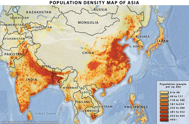
Population Map of Asia


source:http://www.stratfor.com/; Strategic Forecasting Inc. 2008

This is a population density map of Asia, which I found on Google images.  In this map, the areas shaded red represents densely populated locations, while areas colored tan represents either remote or less populated.  After observing the map, the areas shaded red are located near major rivers or are near a water body.  For example, the Ganges River in northern India and Red River in Vietnam.  What I found interesting from the map, the two most populated nations (China and India) their populations are not evenly distributed across their countries, but instead their populations are concentrated in specific areas.  In addition, the colors chosen for this map emphasize Asia's dense population concentrations.