source:http://www.stratfor.com/; Strategic Forecasting Inc. 2008
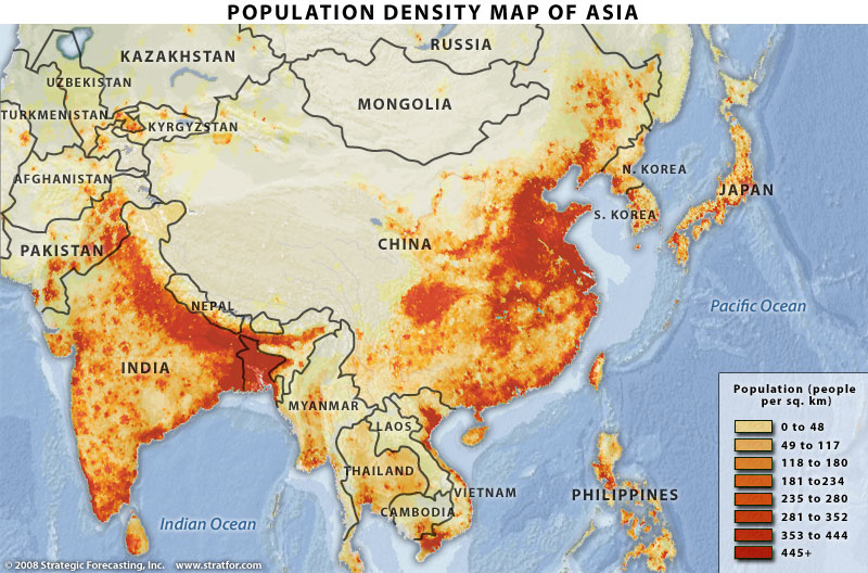
This is a population density map of Asia, which I found on Google images. In this map, the areas shaded red represents densely populated locations, while areas colored tan represents either remote or less populated. After observing the map, the areas shaded red are located near major rivers or are near a water body. For example, the Ganges River in northern India and Red River in Vietnam. What I found interesting from the map, the two most populated nations (China and India) their populations are not evenly distributed across their countries, but instead their populations are concentrated in specific areas. In addition, the colors chosen for this map emphasize Asia's dense population concentrations.
No comments:
Post a Comment